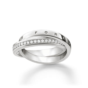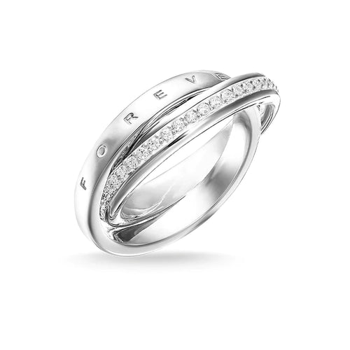

A name on the back of a watch, a date inside a ring or a few words on a pendant can turn a great gift into one that is kept for decades. When you choose jewellery engraving fonts, the lettering is not a finishing detail - it shapes how clearly that message is read, how well it suits the piece and how it will look after years of daily wear.
The best choice is rarely the most decorative font on a screen. Jewellery gives you a very small canvas, and engraving must work with the metal, the available space and the feeling behind the words. A font that looks striking at large size may become difficult to read when engraved inside a narrow band or across a compact watch caseback.
Start with the piece, not the font
Before considering letter styles, look closely at what is being engraved. A broad sterling silver pendant has room for larger characters and a more expressive design. A slim ring, bracelet clasp or watch caseback has tighter limits, so clean lettering often produces the strongest result.
The metal and surface finish matter too. Polished stainless steel, gold-tone plating, silver and titanium can each reflect light differently. Fine, highly detailed lines can lose definition on a reflective surface, particularly when the engraving is shallow or the message is viewed at an angle. A slightly bolder, simpler font creates clearer contrast and remains easier to read.
Curved surfaces need extra care. Text engraved around the inside of a ring or along a rounded caseback will not behave like text printed on a flat card. Letter spacing, character height and the length of the wording all need to be adjusted to fit the shape neatly. This is why the same phrase can suit one item perfectly but need a different layout on another.
Choose jewellery engraving fonts for readability first
Engraving is personal, but it should not become a puzzle. For most pieces, a classic serif, clean sans serif or simple script delivers the best balance of personality and legibility.
A serif font has small finishing strokes on the letters. It can feel traditional, formal and considered, making it a natural fit for wedding bands, anniversary gifts and heirloom-style jewellery. Serif lettering also gives initials and dates a sense of occasion without taking over the design.
Sans serif fonts are clean, modern and highly readable. They work especially well on contemporary watches, minimalist bracelets and fashion-led jewellery, where a crisp message complements rather than competes with the piece. If the engraving area is small, this is often the safest option.
Script fonts bring romance and movement. They can be beautiful for a first name, a short term of endearment or a meaningful single word. The trade-off is clarity: thin loops, close joins and elaborate swashes may not reproduce well at a small scale. A restrained script with open letterforms is usually more successful than an overly ornate handwritten style.
Block capitals can feel bold and direct. They are useful for short messages, initials and coordinates, especially where every character needs to stay clear. However, all-capital wording can look crowded in a long inscription, so it is usually better suited to concise text.
Match the lettering to the occasion
The most suitable font should feel like it belongs to the wearer and the reason for the gift. A graduation watch engraved with a date and encouraging message may suit a modern sans serif. An engagement ring may call for a classic serif or delicate script. For a birthday piece with a playful tone, a softer handwritten font may be right, provided there is enough room for it to remain readable.
Think about the jewellery’s own design language. A sleek black watch, a Daniel Wellington-style minimalist piece or a polished contemporary bangle generally looks best with uncluttered lettering. A vintage-inspired pendant or detailed dress watch can carry a more traditional font with greater ease.
There is no rule that says romantic engraving must use script, or that a watch must use capitals. The strongest combinations create a consistent mood. If the item is understated, let the message and font be understated too. If it is expressive and decorative, you have more freedom to introduce character.
Consider who will wear it every day
A personalised piece should still feel wearable after the occasion has passed. Ask whether the recipient usually prefers timeless styling, trend-led accessories or practical everyday pieces. An ornate font may suit a formal gift moment, but a clean font is often the one they will appreciate every time they check the time or fasten a bracelet.
For pieces intended to become keepsakes, avoid styling that is likely to date quickly. Classic lettering is not boring when it is used well. It keeps the focus on the name, date or words that matter.
Keep the message short enough to breathe
The length of the inscription affects font choice more than many people expect. A 10-character name allows for larger lettering and more stylistic detail than a 40-character quote. Trying to fit too much onto a small surface can force the letters to become so small that even a quality engraving loses impact.
As a guide, choose one meaningful element rather than several. A date, initials, a short phrase or coordinates can say more than a full sentence. “Always with you”, “Love, Mum”, “Est. 2026” and a significant date are all compact options that leave room for the lettering to look intentional.
If you are set on a longer message, choose a simple font and be prepared to reduce the character size. It may also be worth placing the message across more than one area where the item allows it, such as an inside and outside section of a piece. The right solution depends on the design and engraving space available.
Pay attention to letters that can blur together
Certain characters need more room than others. Script capitals, lower-case letters with loops, and combinations such as “rn”, “cl” or “ll” can become visually crowded. Numbers should be equally clear, especially for dates. A tiny difference between 3, 8, 5 and 6 can matter when the engraving marks a milestone.
This is also a reason to proofread before engraving begins. Check spelling, punctuation, capital letters and date format. Decide whether you want 05.04.26, 5 April 2026 or 05/04/2026, as each format takes up a different amount of space and creates a different visual feel.
Do not forget symbols and layout
A small heart, star, infinity symbol or simple divider can add meaning without requiring extra words. Symbols work best when they support the inscription rather than replace clarity. On a compact surface, one well-placed symbol is generally stronger than several tiny decorative marks.
Layout matters as much as the font itself. Centred text often feels balanced on pendants and broad casebacks. A single line is usually cleaner than multiple lines, but a short two-line layout can work where the surface is wider than it is tall. Initials separated by a dot, heart or ampersand are a popular option for couples because the design stays compact.
Be mindful that some engravings are intended to be private. The inside of a ring or the reverse of a watch can carry an intimate message that does not need to be visible to everyone. In those cases, a classic small font can make the message feel personal rather than performative.
Ask the engraver what the piece can take
The final choice should always take account of the engraving method and the condition of the jewellery. Some items have a coated finish, textured surface, stones close to the engraving area or limited flat space. These features can affect what is practical and what will produce a lasting result.
An experienced engraver can advise whether your preferred font is suitable at the required size, whether a short version of the message would read better, and where the engraving will sit most cleanly. At Watch Express, engraving is supported by practical on-site service knowledge, which is particularly useful when the piece is also a watch or needs inspection before personalisation.
Bring the exact wording with you, but stay open to a small adjustment if it improves the finished piece. Swapping a long quote for initials and a date, choosing a cleaner script or removing one symbol can make the difference between an engraving that merely fits and one that looks made for the item.
A well-chosen font should not shout louder than the jewellery. It should make the message feel natural, clear and worth returning to - whether it is read tomorrow, on the next anniversary or many years from now.
Gift Ideas For You